Accessifying Accessify.com for iPhone
One of the things I wanted to do with the rebuild and restyle with Accessify was to make it a little more slimline in terms of HTTP requests (in other words, fewer requests for style sheets that are not needed - one CSS file to do the lot) yet still support other devices. I have to confess that while there is just one CSS file (which has a far future expires cache setting on it so as not to cause needless reloads), which does include screen and print styles, I’ve only really taken care of the mobile display on the iPhone, mainly because that’s what I use and have found easy to test on!
I saw this article regarding style sheets for mobiles today (thanks to Brucey and Twitter) and it prompted me to share some of the tweaks that I did for iPhone friendliness. The key thing was not to massively redesign the site’s look and feel for a specific device, but rather give certain elements a notch up or down in size to make them usable for those small pointing devices that you and I know as fingers. So, for those interested in doing something similar, here are a few notes and doodles
A bit about the CSS
I’ve not implemented the suggestions in the article linked to above (I only discovered the link), but will almost certainly revise my approach accordingly. I did, however, use the media type using the max-width property to pass iPhone-specific style overrides to that device:
@media screen and (max-device-width: 480px)
{
	#primarynavigation {font-size:3em;}
	#blog_search {display:none;}
	etc etc
}
The effect on the design
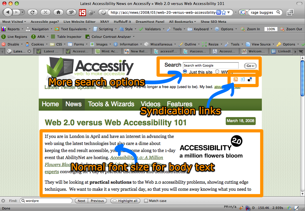
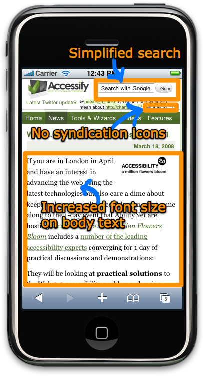
The thumbnails below link through to larger, annotated images (PNG) format, showing how subtle changes to font size can make the site much more readable/usable on a small screen device but without ditching the entire style sheet. Depending on the style of your site some of this may be easily do-able, some of it may not. Your mileage, as they say, may vary.
Simplified search area and larger body copy
The search area on Accessify was simplified for iPhone and pared back to its bare minimum. Likewise the tiny syndication links (to Twitter et al) were removed also. Some might argue that this is wrong as I’m hiding functionality, but it’s not critical functionality (in my opinion). Also, the body font size is boosted for easier readability:
Footer categories - font size boost
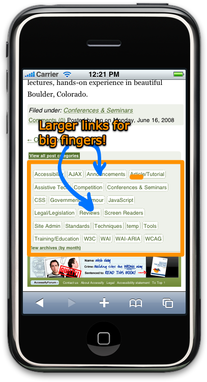
At the end of the news page is the list of Wordpress-generated categories and archives. These were almost unusable on the iPhone without first zooming in and then making use of the world’s tiniest finger, so it was time for another font size increase:

Not just accessify …
I’ve also been trying my best to apply the same treatment to other sites that I have ticking over, for example the book support site (which has been around for a couple of years now). I recently updated that a little and found that while it generally rendered OK, it could also benefit from some font size boosts. In particular, the tab navigation elements which work fine on a normal desktop browser were somewhat lacking. For the iPhone I opted to change these tabs to buttons that sit like a small stack of (rounded-off) bricks. Once again, a subtle change but just enough to make it more iPhone-friendly:


So, like I said earlier, nothing too earth shattering here - just an exercise in giving your style sheets just the slightest of tickles to make the site markedly easier to read on a small screen device but without resorting to a completely different style sheet or no style whatsoever.
Now, I need to go back and read that article and see what I cab do for other handheld devices. If anyone can point me in the direction of some emulators that I can run on my Mac, I’d really appreciate it!