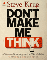
Don't Make Me Think
Posted on: 03 February 2003
[Introduction] [Topics covered] [Summary] [Rating] [Factbox]
Introduction
 Every
now and then a book comes along that you just have to add to your
collection. And every once in a while you seem to miss that essential book
that everyone else is raving about. Steve Krug's 'Don't Make Me Think' is
one such book - one that I always intended on getting and have only now
got some 2-3 years after its original publication. However, despite its
age (old-ish in web years) it still holds up as one of the best books on
the subject of web usability.
Every
now and then a book comes along that you just have to add to your
collection. And every once in a while you seem to miss that essential book
that everyone else is raving about. Steve Krug's 'Don't Make Me Think' is
one such book - one that I always intended on getting and have only now
got some 2-3 years after its original publication. However, despite its
age (old-ish in web years) it still holds up as one of the best books on
the subject of web usability.
So, what is it about this book that managed to capture my attention?
Topics covered
Normally, when looking through the index of a book you're presented with some fairly standard chapter headings that tell you exactly what you're going to get. Oddly for a book based on usability, the index for 'Don't Make Me Think' actually did just that - titles such as 'Animal, Vegetable or Mineral', 'The Farmer and the Cowman Should Be Friends' and 'On Not Throwing the Baby Out With the Dishes' revealed little about the content of those chapters. However, they did intrigue me.
Chapter 1 - Don't Make Me Think
Well, this is the crux of it - Steve Krug's first law of usability is that the user should not need to think about what the purpose of a page is. The 'user' (a phrase that Mr Krug hates, by the way!) needs as few distractions as possible to complete a task and not have to ask questions about a site: "Is that the main navigation for the site? ... Can I click on that? ... Where do I start?". He explains how simple things like presenting clickable graphical links as flat text rather than a button with a defined edge can cause people to stop and think - "Is that where I need to click?". Times that by the number of such links/buttons on a page and throw in dome other confusions and now you've really got people thinking!
The first chapter also covers how to make a search input simple and effective, using Amazon as an example.
Chapter 2 - How We Really Use the Web
This very short chapter lays out the groundwork for how people look at web pages - or rather how they don't look at them but instead scan for keywords, recognisable shapes, conventions until something jumps out of the page that seems most relevant to them. To many people, this may not be a revelation. However, as well as the 'people scan web pages' advice, Krug also argues that most people do not necessarily do things as we would hope/expect them to, but in the large part simply muddle through - and then stick with that method on future visits (no matter how long-winded!). Armed with this knowledge, we can safely progress to ...
Chapter 3 - Billboard Design 101
"We're thinking 'great literature' (or at least 'product brochure'), while the user's reality is much closer to 'billboard going by at 60 miles per hour'."
And there's the challenge - how do you design a web page that's barely going to be read by the majority? The answers are things such as making a page hierarchy abundantly clear, breaking pages into easily identifiable areas with different purposes, sticking to well-founded conventions in web page design and keeping the noise down (removing any unnecessary clutter).
Once more, people who have been designing pages for some time might feel that some of the advice here is not new. However, it's still a great refresher course with appropriate examples illustrated clearly.
Chapter 4 - Animal, Vegetable or Mineral?
A chapter? What all three pages of it? Let's move on (and if you're intrigued about what the title of the chapter means, it's about presenting simple choices to the user that are totally unambiguous). Ok, next ...
Chapter 5- Omit Needless Words
The title of the chapter says it all - be ruthless. Cut the crap and get to the point otherwise people won't read what you have to say. For example, cut the 'happy talk' ("Welcome to our site - we hope that you find it a pleasurable blah blah blah"), and don't make instructions too onerous. Using Verizon as an example, Krug shows a before and after for instructions - Verizon's had 103 words, Krug's had 41 words. I know which one I would read and absorb.
Chapter 5- Streetsigns and Breadcrumbs
Now we get into the important topic of orientation - the 'where am I' and 'where can I go next'.
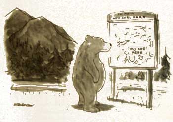
©2000 The New Yorker Collection from Cartoonbank.com
Krug explains how he finds driving in LA an absolute pleasure compared to Boston because the signage is so good - never any question about where you currently are and where you can go next. As he puts it, he is not forced to think. It's the same with web pages and sites, as this chapter demonstrates.
Breadcrumb trails are analysed, broken apart and generally tested to see how effective they are (not so when they double up as page titles), while tabs get a very thorough look at. Almost half of the chapter appears to be devoted to Amazon and why they are doing things right. Admittedly, Amazon's site has changed somewhat since this book was published but the basic theory still exists on their site.
My favourite part of this chapter is 'the trunk test'. Krug gives the metaphor that you have been bundled blindfolded into the trunk of a car driven about a bit then landed on a web page. The trick is to identify:
- What site is this?
- What page am I on?
- What are my options at this level?
- Where am I in the scheme of things?
And so on. The key thing that came across for me was that very rarely do information architects, web designers or project managers think much beyond the third tier of navigation, an area where much of the browsing takes place. This is usally borne out when you try the trunk test on some of the lower level pages of many sites - they just scream 'afterthought'!
Chapter 7 - The First Step in Recovery is Admitting that the Home Page is Beyond Your Control
How true. This is prime real estate - it's where everybody wants to be, and therein lies your battle - you have to structure something that is usable for the person browsing your site, not pander to management or marketing desires to have 'shortcuts' to something that is important to them. As Krug puts it "Everybody wants a piece".
The chapter covers a number of features that you might expect on a home page, such as tag lines that say what you actually do (rather than say something interesting but ultimately cryptic), advertising, rollover effects and drop-downs for navigation.
Chapter 8 - The Farmer and the Cowman Should Be Friends
Eh, what the heck is that about? Krug and his chapter titles, eh?! To paraphrase, most web development teams waste time arguing about usability and never come to an agreement. Krug refers to what he calls 'religious debates' - like discussions about religion you end up going around in circles but you'll never change hearts and minds.
Now throw in the fact that there is no such thing as the average user and all your 'the average user likes this' arguments become pointless. So what's the solution? Well, it's to watch how people react to your ideas and let their behaviours enlighten you - perhaps your deep-held convictions might be trashed in an instant?
Chapter 9 - Usability Testing on 10 Cents a Day
Not every company has a usability lab. Strange that. So, this chapter describes how you can carry out usability testing on a budget. Krug details the difference between focus groups and usability testing (but does not really explain the idea of user centred design here), before explaining how to do things cheaply - the 'Lost our lease, going-out-of-business-sale usability testing'.
The 'lost our lease' approach offers traditional excuses people make for not carrying out usability testing and Krug's counter arguments for why you should and how you can not afford not to.
Chapter 10 - Usability Testing: The Movie
We're nearing the end of the story now - and we end with the movie. Or to be more precise, an example script of a movie. Krug sets out the kinds of phrases that you should say to people taking part in a usability test to put them at ease and to encourage them to give appropriate feedback at the appropriate time - and all of it caught on camera.
This all makes perfect sense, but I couldn't help but think that Krug has been very brave by giving so much of the usability process in this book. Talk about doing yourself out of a job!
Chapter 11 - On Not Throwing the Baby Out with the Dishes
You've had your usability test, you've discovered where the problems are in your site. Now what? Fix them, silly! Only problem is, the desire to fix each and every problem that your test participants picked can often result in the introduction of other problems. This final chapter is all about having a little restraint and going into the fixing process with some sanity.
Summary
There is a quote on the back of the book that says something along the
lines of 'buy in bulk to get a group discount and get a copy for everyone
involved with web design'. I couldn't agree more - this is the kind of book
that I wish departments (much like the one I work in) would buy
for any new starter on the team. Common sense is not something that everyone
has, but Steve Krug's book can certainly fill that gap. One of the best
books on web design/usability that I've read in a long time. I just wish
I'd read it earlier.
Review by: Ian Lloyd, March 2003
| Rating (out of ten) |
|
|---|---|
| Practical advice: | 10 |
| Shelf life: | 9 |
| Appendices/Reference materials: | N/A |
| Appropriateness for beginners: | 8 |
| Variety of topics covered: | 8 |
| Overall: | 10 |
| Factbox | |
|---|---|
| Title | Don't Make Me Think |
| Publisher | New Riders/Circle |
| Written by | Steve Krug |
| ISBN | 0-7897-2310-7 |