Finally. At last! [insert similar phrase of own choosing here] … It’s done!
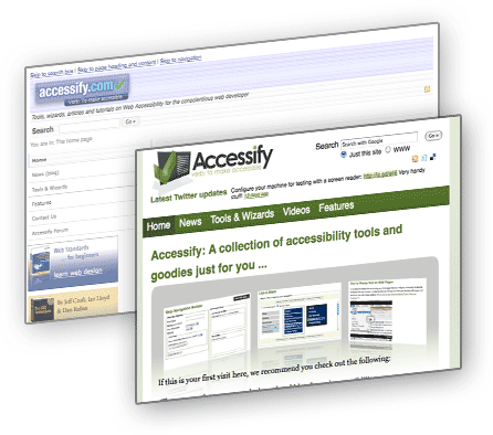
It’s taken me an absolute age to get this thing live and, if I’m completely honest with myself - and anyone else who happens to be reading this now - I’m still not totally happy with the end result. You see, I’m not much of a designer, and cannot help but criticise my own efforts (and I sure as hell know that others will want to take a shot at the ‘design’ of this). But hey-ho, one has to know his own limits!
I’ve needed to take a look at this site for so long but unlike many of my peers, I don’t actually live and breathe web development and (despite what my wife may claim!) I don’t spend all of my free time on the computer. The truth is, I usually have something like a 30-minute to 1-hour window of opportunity late in the evening to really concentrate on this kind of thing, when everyone and every animal is asleep. But by that time I’m tired too. And that, my friends, is why it’s taken me years to get around to giving the site a facelift!
So, what’s new?
Apart from the obvious visual changes, I’ve done the following:
- Added some new tools and updated some older ones:
- Quick Page Accessibility Test - a favelet-based page check tool (explained best in this video)
- Skipnav Builder - builds skip navigation links!
- jQuery Function Builder - simple, but potential time-saver
- List-O-Matic - gets a complete facelift and now allows nested navigation
- Updated the blog template
- Added some new screencasts/videos
- Tidied up JavaScript on the site (unobtrusive, jQuery based)
- Used JavaScript to add in some other site features (e.g. ARIA landmark attributes)
- There’s also been a lot of pruning of useless functionality (style sheet preferences, anyone?)
What’s still to do?
- Well, the accessibility videos section is sparse. I am going to add to that in coming months - both videos created by myself and third party videos/screen casts
- A Wiki - it’s structurally there but needs more work from some other parties (you know who you are, and I’ll be in touch soon!)
- Some new content! Yes, the site is still there largely for the purposes of holding the tools, but in these days of micro blogging, perhaps it’s time to buck the trend and do some fuller postings? With a site that I’m happier to work with, this is far more likely to happen!
- Fix some validation issues on the blog - little niggles really
- Oh, and some new tools … either as I think of them or as people ask for them (and assuming that I can build them!)
I hope that visitors to the site like the change and find something of use here. I’ll really do my best not to let this stagnate from here on in, I promise!
So says Jared Smith
Looks great! Aren’t redesigns fun… in a very masochistic kind of way? A few minor recommendations (if you don’t mind):
- The contrast of the tagline of the logo is very low - doesn’t even meet WCAG AA levels.
- The bottom of the text in the Twitter Updates box is being cut off by the box below. It needs just a few more pixels.
I like the updates a lot!
Added January 16, 2009 at 3:28 am
So says Jared Smith
Oh, and this page now says “No comments yet” just above my previous comment. :-0
Added January 16, 2009 at 3:30 am
So says John Faulds
I like the new design and I’ve bookmarked the jQuery builder, I’m sure it’ll come in handy.
Added January 16, 2009 at 4:04 am
So says Dan Schulz
It may be sparse, but it’s functional. Besides, a design should never compete with the content - instead, it should compliment and enhance it.
Added January 16, 2009 at 8:17 am
So says Ian
Replying to Jared about comments not showing … I had comment moderation on (because the site has been stagnant for some time I tend to do them in batches, but I’ve removed moderation just for a short while and will watch more closely). I’ll deal with those other points ASAP.
Added January 16, 2009 at 11:29 am
So says Mike Cherim
Looks good guys.
Added January 16, 2009 at 3:51 pm
So says Blair Millen
I’m loving the new design Ian. Fresh and clean and very 2009!
Added January 16, 2009 at 5:23 pm
So says Virginia
Congratulations. Looks wonderful (love the typography choices) and improved functionality, too. Great job.
Added January 16, 2009 at 10:47 pm
So says Tim Roberts
Well played Ian. Looks bloody good.
I dragged a load of old content of the defunct made for all (some of your stuff on there) and placed it at http://www.made-for-all.com for prosperty. I don’t plan to put too much more on there, but the articles were well worth giving a home again after so many years offline. Of course any new articles are welcome.
¡Keep up the good work señor Lloyd!
Added January 20, 2009 at 11:24 pm
So says William Lawrence
I almost didn’t recognise this site. I thought for a moment I had mistyped the URL, or something. Very well done. Good job and keep it going!
Added January 21, 2009 at 6:29 am
So says Latest Accessibility News on Accessify » What to do with Accessify
[...] few months ago I finally finished a redesign. That redesign (and rebuild) had been in the making for months itself and I thought that once it [...]
Added June 12, 2009 at 11:26 am
So says ニコン 一眼レフ
The ultimate fix for men that one can find out about straight away.
Added December 9, 2013 at 11:32 am